The Cut - Redesign
The Cut has been redesigned from the ground up to better serve its users and deliver a more seamless experience. This update includes a complete overhaul of the color palette and app layout, along with a restructured navigation bar and improved app flow.
Redesign done in colaberation with Sophie Carter and Isabelle Ritz.
Deliverables
My Contributions
-
App Case Study
-
App Walkthrough
-
UX/UI designed App Prototype
-
Checkout UX/UI Design
-
Case Study Research
-
Color Pallet


Functionally, The Cut fulfills its core purpose—connecting barbers with clients. However, its current visual design fails to elevate or support this functionality. The interface lacks cohesion and doesn't effectively highlight the app’s strengths, making a redesign essential to enhance user experience and engagement.
Problem Statement
Redesign Strategy
Our goal was to make the app more user-friendly by reducing cognitive load wherever possible, creating a more enjoyable and functional experience overall.
-
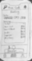
Booking Page - was designed to keep all essential information on a single screen. This approach helps users feel more confident in their booking decisions and minimizes mistakes during checkout. As the area I contributed to most heavily, designing within the constraint of a single screen pushed me to think critically about space, hierarchy, and simplicity—ultimately helping me grow as a designer.
-
color palette - was refined to give the app a stronger and more cohesive visual identity, without completely abandoning the original look. The updated colors strike a balance between familiarity and freshness, helping reinforce the brand while supporting a cleaner and more accessible interface.


Before and After


Ideation and User Testing Feedback
To begin the redesign of The Cut, we first created rapid prototypes of updated page layouts and conducted user testing. Our focus was on improving the home screen, profile screen, and checkout screen to streamline key parts of the user journey. Prototyping allowed us to quickly visualize ideas and identify potential issues before moving into high-fidelity design.
User testing revealed several valuable insights. While participants found the new designs visually clean and more organized, there were still areas for improvement—particularly in navigation. Users preferred gestures like swiping or using arrows over tapping an 'X' to close screens. Additionally, there was a strong desire for clearer, higher-quality photos on the barbers profile pages.
Usability Heuristics
To successfully redesign The Cut, a Usability Heuristics evaluation was conducted. The results identified key areas in need of improvement, specifically the color palette, user flow, and navigation bar.
One of the major issues was the overwhelming amount of information presented to users at once, which created a heavy cognitive load and hindered overall usability. Additionally, the original design did not align with established design conventions, further negatively impacting the user experience.

